Greetings friends!
Today we'd like to share another small update about the progress with CryoFall development!
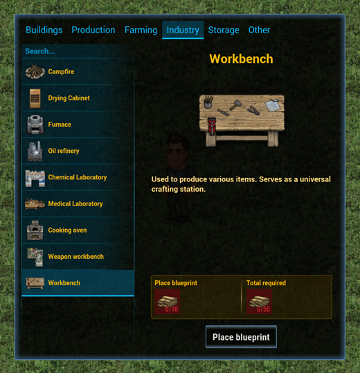
After our first Closed Test we've received some feedback regarding the construction menu in the game. Obviously it was never meant to be a permanent solution, but it was something that clearly needed improvement. So, we decided to completely redesign it and implement a few nice things in the process.
You can see the result of this change below:
First of all, you can now find all the buildings easier with our categories tabs in the upper part of the screen. We are still not decided on a particular logic behind this separation, but it can be changed in minutes, so we will gather more feedback during the next test! Oh, and you can also use the search feature to find a particular building if you don't remember where exactly it is located.
Secondly, you can see that we've added tips about each construction - what they are needed for and what resources you will need to build them. This should make it easier to plan your expansion ahead and understand what each new building does.
Well, that's more or less it for the building menu! Very simple and hopefully - convenient!
Finally, I'd like to mention that at the moment we're working on the skills menu and the character skill system in general! If everything goes well we will be able to share more details next week!
I hope you found this interesting! Make sure to join our forums and follow us on Twitter and like our Facebook page!


