We are finally done with the current version of user interface for the main game screen!
Here is what it looks like now: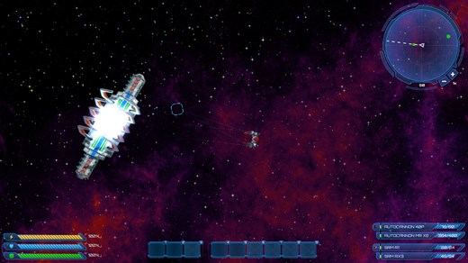
Things to note:
- Ship stats on the left - energy, shield and armor bars.
- Quick access bar in the center - which allows you to use consumables, such as shield boosters, and devices, for example mining gear or EMP generator.
- Weapon groups on the right - where all weapons which are equipped on your ship will display its information. All weapons are divided into three groups and can be fired separately at will.
- And finally radar - it simply displays all objects that are near your ship.
And that is it. I think it looks quite good already, but we will still polish it more to make it look even better.


